 I've just recently returned from the 2011 edition of the Hyères fashion and photography festival which takes place at the Villa Noailles. For those who are not familiar with Hyères (I was not until a couple of years ago) it's important to note the use of the word "and" between 'fashion' and 'photography'. This is not a fashion photography festival but a festival with two distinct parts. Given that I know next-to-nothing about fashion photography and possibly even less about fashion itself, I wasn't sure what to expect, but I came back genuinely energised.
Hyères doesn't have the same visibility as the Rencontres d'Arles and in fairness the festival takes place on a much more intimate scale than the vast sprawl of it's cousin from up the road. Whereas a lot of the work being presented in Arles is well-known and critically recognised, Hyères functions more like a photographic incubator, both by focusing the competition on emerging young talent and also by exhibiting work that you are unlikely to see elsewhere. For instance the 2011 festival included a selection of Erwin Blumenfeld's photographs all of which were used as Vogue covers, something you are unlikely to see in a photography museum. After seeing this show and stepping into a newsagents, I couldn't help feeling that fashion photography as a genre seems to have regressed hugely from the inventiveness and experimentation of Blumenfeld's era, particularly for established magazines like Vogue.

The core of the photography component of the festival is a group exhibition of a shortlist of 10 emerging photographers, one or several of whom are selected by a jury for a grand prize. A look back at the shortlisted photographers from previous festivals and you are guaranteed to find not only excellent and exciting work and a lot of genuine discoveries. This year was no different, with work by Andrey Bogush, Kim Boske, Emily Hyperion Dubuisson, Katarina Elvén, Anouk Kruithof, Ina Jang, Mårten Lange, Marie Queau, Awoiska van der Molen and Marc Philip van Kempen. Most of the short-listed photographers have no experience of fashion photography at all and, in addition to the grand prize, a few of them may find themselves trying their hand at it for the first time following Hyères, an exercise which I think would be fascinating for any emerging photographer.
This year's grand prize winner was the young Dutch photographer Anouk Kruithof. She was selected unanimously by the jury for her inventiveness and her versatility. The series she presented at Hyères, the Daily Exhaustion, is a wonderfully simple idea in an equally wonderfully simple book/zine form, but I also recommend a trip to her website which is full of interesting material. A special mention was also given to Katarina Elvén, a set designer from Sweden who is working on a an ambitious but very thoughtful project relating to surface and aesthetics... one to look out for in the future. I also made another discovery in Hyères, but this one was on the jury rather than the shortlist. Fellow jury member and a photographer, provocateur and penseur, Jason Evans: the man behind the Daily Nice, the New Scent, contributor to the terrific Words Without Pictures and much more.

One particularly refreshing aspect of the festival is the time that is allocated to see each photographer. Portfolio reviews, which appear to be becoming more and more popular, seldom offer more than 20 minutes per review whereas at Hyères jurors spend between anything between 30 minutes and 1h30 with each of the shortlisted photographers, almost enough time for a conversation. But the thing that really makes Hyères stand out from other photography festivals is that it creates a space to consider photography in a different context. Just by combining fashion and photography, the festival is forcing us to reconsider what we think of as photography and offering a reminder of how insular the 'fine art photography' world can be. Whether you like fashion photography (or any other applied photography for that matter) or not, it has to be recognised that it is too often dismissed as inferior or just plain ignored by the art photography world. During my four days in Hyères I found myself having more conversations about photography in its many different forms than I have at all the other photography festivals I have attended put together.
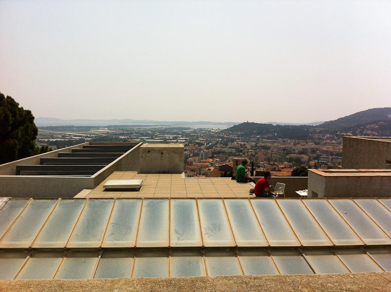
 Aside from these issues of substance, combine the fact that this all takes place in an absolutely gorgeous 1930s modernist villa and that being on photo-jury duty also involves a collective swim in the Mediterranean and you will understand why Hyères has immediately become a personal favourite.


